Branding and logo design concept for personal blog exploring the food industry
A friend of mine who has been working in the food industry for sometime approached me with the idea to create a personal website for sharing thoughts and discoveries of hidden pockets or niche interests within the industry. “Fooodish” is meant to be read “Foood-ISH”, a direct reference to the “ish”ness of topics he’s prepared this space for (if that makes sense). I was asked to design a logo for the website, though for various reasons this larger project was ultimately discontinued.
Having the power to help determine a lasting visual identity of a person, group or idea has always been fascinating, though my last time designing a logo dates back to my studio classes from college. With an opportunity to revisit the topic for the first time in a couple years, I decided to continue developing my designs.
Concept 01
Throughout the brainstorming process, I repeatedly ran into designs that led to misreads of the title. In FIG.01, for example, the three connected ‘O’s reminded me of the ‘typing’ icon in message platforms, which more obviously points to the website's function as a platform for discussion. Unfortunately, it also results in a misleading emphasis on the word ‘dish’.
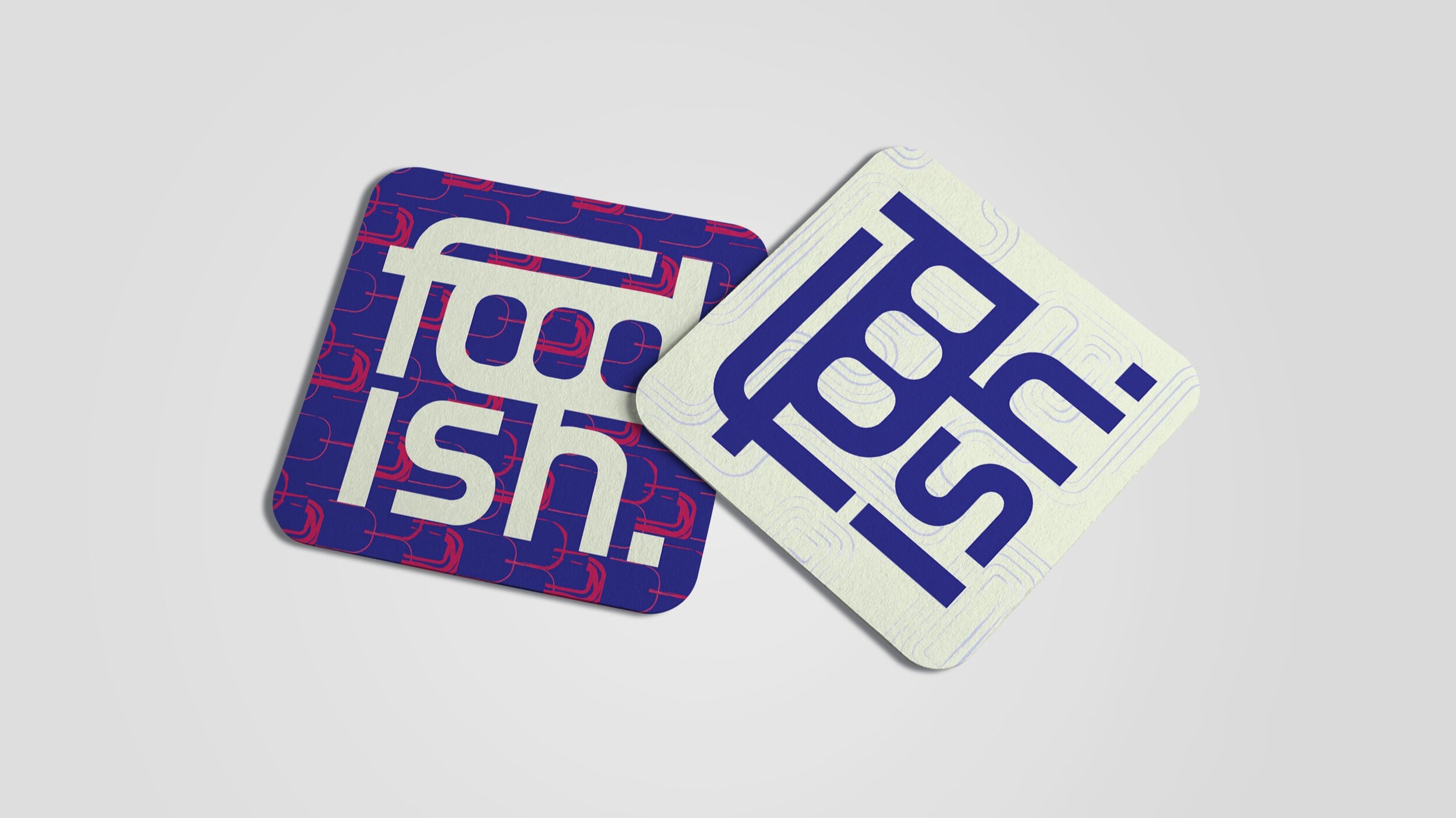
Ideally, this logo also needed to easily adapt into a square format for better fit and visual presence on social media profile platforms and on merch (FIG.02-04).
Concept 02
…follows the same color palette, but attempts to address more of early vision of the website's owner. He was very interested in the liquid warp look, which I was hesitant to fully commit to, simply because of the challenges it would present in readability, especially as a title that is just emerging in the industry.