Ad campaign promoting St. John Fisher University’s online Master of Science in Nursing program.
St. John Fisher University is a Catholic liberal arts private institution based in Rochester, New York. Based on marketing data collected from previous campaigns, it was apparent that the ads performed best regionally, within upstate New York. The Brand team hypothesized that by producing a fresh set of paid social ads with NY-tailored messaging, we might see a boost in lead volume to begin the prospect conversion process.
We tackled the campaign with with three thematic approaches, all the while making sure our messaging aligned with the core ask of regional NY targeting for Fisher Nursing through copy, design, and featured imagery.
Concept 1
The first theme we explored, prompted by Brand’s initial suggestion to speak on Fisher nurses and their impact on COVID-19, targets nurses’ contributions to the community and their vital presence in various settings.
Overlay messaging (copy) here acknowledges the active roles played by nurse practitioners throughout the pandemic, while design and imagery show nurses as not only occasional community health volunteers, but also visibly present in home-health-care-provider space treating seniors at their own homes as a response to nursing home room/staff shortages due to COVID-19.


Concept 1.1
The explanation behind the ‘1.1’ in the heading is simply that I am approaching this project from a design standpoint, and the design overlay here carries over from our first thematic exploration.
We shift gears here to highlight SJF University’s basis in NY, while featuring a season-appropriate campus image to show off the bright palette of upstate NY fall scenery.
Concept 2
For our second approach, we wanted to specifically call out the New York location. Messaging in this set centers on the idea of "service in NY", while design utilizes the state's silhouette and outline to help specify the "lens" with which we view this program/degree's positive impacts.
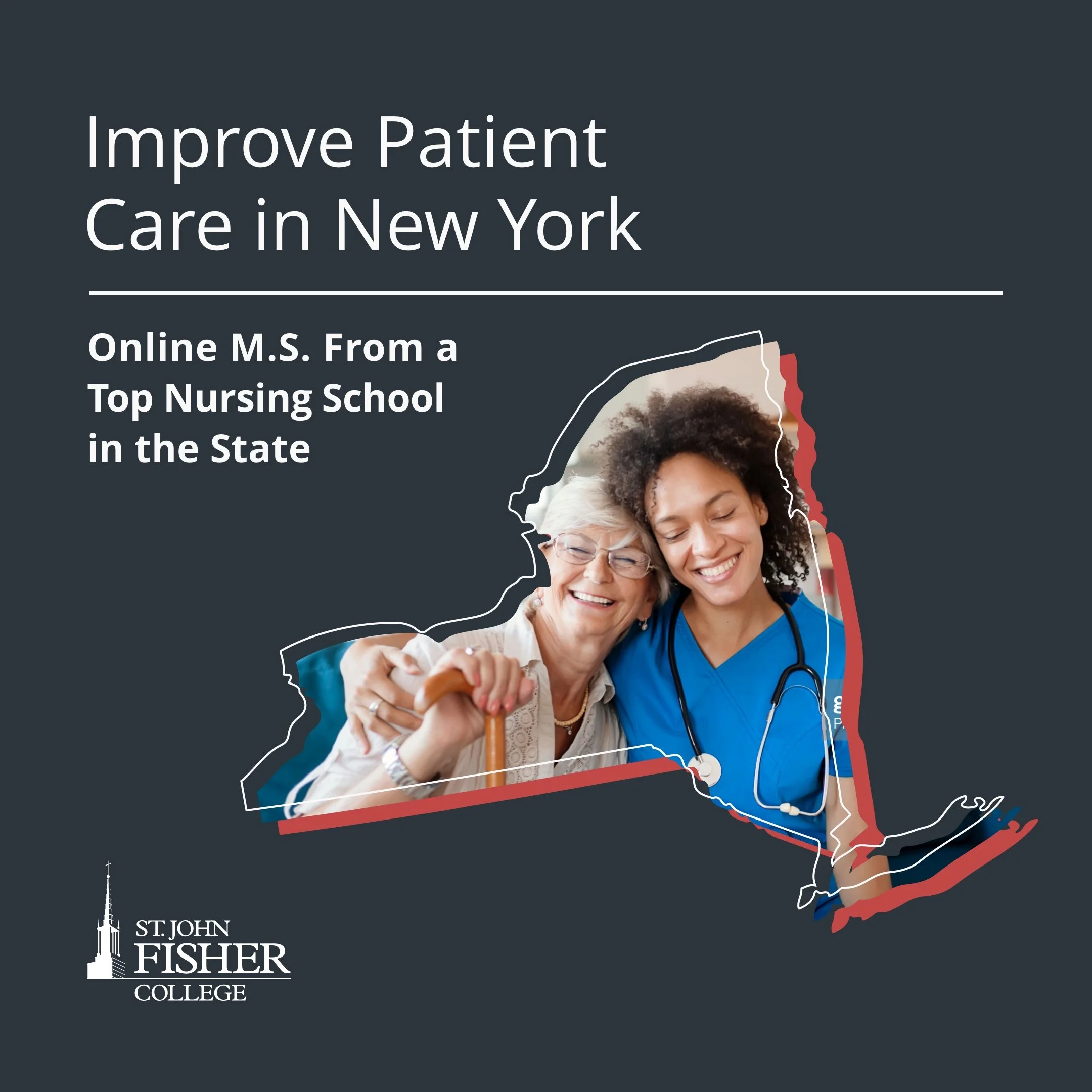


Among internal stakeholders, this second set of designs was most widely favored. But to everyone’s surprise, school feedback noted that they felt the NY-state silhouette was too much “a departure” from their usual aesthetic, so we reverted back to a more conservative design. Final deliverables for ‘Concept 2’ ended up looking something like this:


Concept 3
Our final theme returns to Fisher Nursing with messaging language that's more technical, and utilizes school imagery that features the program's students and faculty. Design takes on the more boxy, linear stylings from the program’s web pages to align with this conceptual direction.


Concept 3: Carousel Design
We also proposed testing out a carousel component (as seen on Facebook’s paid social platform), which we thought would be an excellent opportunity to call out each of the four tracks offered under this program. The carousel set includes one title frame followed by four individual frames. Similar to the way I approached the design of the ads under this third concept, I drew inspiration directly from the program’s website as well.
Brand Strategy: Kayla Branch | Digital Media Strategy: James Reyes | Marketing Management: Grace Collins | Traffic/CPM: Shelby Bossert, Nicole Riibner | Copy Direction: Betsy Plowman | Copy Management: Annie Cottrell Johnson | Copy: Ashley Brown | Art Direction: Billy Candela | Design Management: Justin Harrison | Design: Mimi Shang | Art Production: Storm Sebastian